Sunday, December 7, 2008

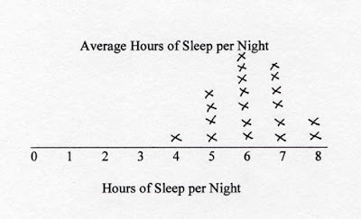
Stem and leaf plot


A stem-and-leaf plot is a display that organizes data to show its shape and distribution. This plot map shows the average hours of sleep per night, over hours of sleep per night. This person is getting a nice amount of sleep, averaging around 6 hours per night. Although, it does vary depending on age and amount of physical activity during the day. It is reported that teenages and young adults need around 8 hours of sleep per night but they typically do not get it, especially college students. This map would be more useful if it provided the information of the person or people that were involved in giving the information.

URL:http://www.qacps.k12.md.us/cms/sci/tools/MATHTBX.HTM

Box plot

This box plot was taken from the Michelson-Morley Experiment. This was one of the most important experiments in the history of physics.

URL:http://en.wikipedia.org/wiki/Box_plot

Histogram


A histogram is a graphical display of tabulated frequencies, shown through the use of a bar graph. This particular graph is a horizontal way of viewing the histogram. It is a graph of a jockey team and I believe the numbers are the various scores and statistics of their season. It is important to realize that GIS and mapping span across all different types of professions, hobbies and entertainment aspects of life, because they can be useful and make time more efficient.

URL:http://www.daisy2000.com/Daisy2003/horizontalhistogram.html

Parallel coordinate graph


parallel coordinate graph is used to plot large sets of data. This is convenient for people using various different variable and factors that are equating to the desired outcome. I suppose this may be efficient for a scientist who has a control and different tests to see if the hypothesis matches with the desired theories.

URL:http://raffy.ch/blog/2007/03/

Triangular plot

Triangle plots also are very self explanatory, in the fact that they show information and plot this data in a triangular form. This map shows the votes of people based on the classification of themselves such as, liberal democrat, labour, and conservative. This is useful in politics and government dealings and issues.

URL:http://ex-parrot.com/~chris/wwwitter/200504.html

Windrose


wind rose is a graphic tool used by meteorologists to give a succinct view of 
how 
wind speed and direction are typically distributed. This windrose shows the speed in knots, which is the generic way to measure wind. This type of map would typically be useful for sailors or pilots.

URL:http://www.climate.washington.edu/climate.html

Climograph


climograph is a graphical depiction of the monthly precipitation and temperature conditions for a selected place. This map is of Walgett, Australia. One can see that this map not only provides statistical and weather related information, but it also provides cultural information. The temperature is given in Celsius, thus meaning that this map would be quite useless to an American who doesn't have access to a convertor or who has never dealt with Celsius before. It's interesting how maps give us clues to a country's culture, even without meaning to.

URL:http://www.uwsp.edu/geo/faculty/lemke/geog101/lecture_outlines/09_global_climate_patterns.html

Population profile

Population profile maps do just what their title says they do. They show various information regarding population and population change. In this example it uses three profiles of patterns of population change, involving growth in three different countries: Kenya, USA and Germany. Kenya had rapid growth, US had slow growth and Germany had negative growth.
I'm sure a nutritionist or a medical doctor or even a sociologist could use this information to study how the various aspects of how one's culture and environment affect their life and growth patterns.

URL:http://jmaps2008.blogspot.com/2008_09_01_archive.html

Index value plot

The index value plot displays statistical information through visual means, this such example being the average streamflow index in the United States since January 16th, 2001. There were 1341 sites included in the research, so one can know that this map has been researched quite a bit, and has taken various perspectives. This is an important element in map making, and can be a controversy in some cases, if not enough people have been used in the numbers.

URL:https://blogger.googleusercontent.com/img/b/R29vZ2xl/AVvXsEhcLmQKvng5_ZJjG6ebexrP4p8vLOG_WtY67Wz_x27zVYzVZ5C6MeibTadBI7oTpCer-PbK9SX0Y8LLb5WZ20tppw4G96PmdwGBHrODwMHooxsIK2V84haXTDiuv4HX6wp3Z1qnP4xKLTE/s1600-h/index+value+plot.gif

Lorenz curve


The lorenze curve shows the ways that probability distribution is dispersed. This map photograph of a lorenze curve shows the perfect equality reference line compared with the area of inequality, in reference to a cumulative percent of income and cumulative percent of population. This is out of 100%.

URL:http://mcatfordummies.blogspot.com/2008/08/accumulative-line-graph-or-lorenz-curve.html

Bilateral graph


bilateral graph displays increases on one side of a zero line and a decreases on the other side. Basically, it compares two sets of statistical information. 


URL:http://mymapcatalogfsu2008.blogspot.com/2008_11_01_archive.html

Nominal area choropleth map


A nominal area choropleth map is used to dispaly nominal data, and nominal data is typically categorical data where the order of the categories is arbitrary. This is one such map of the entire continent of Africa, portions of southern Europe, and Western Asia. This would be important for African political figures to see their surrounding nations and the distance they are from them. Although Spain is technically in Europe, it is much closer to Morocco than Morocco is to Somalia or Kenya or most other countries in it's own continent, Africa.

URL:http://dianesmapcatalog.blogspot.com/2008/08/nominal-choropleth-map.html

Unstandardized choropleth maps


Unstandardized choropleth maps utilize numbers when displayed. This map shows Forage-Land use for all Hay and all Haylage, Grass Silage and Greenchop Harvested Acres, in 2002. This type of map would be useful for a student majoring in any of the agriculture sciences or fields, or a farmer looking for certain types of land. It's interesting to see how there are more harvested acres out in the Northwest than any area in the country. I would have thought the biggest area would be the south or even the north east, since the Europeans first started to cultivate that land when they arrived here.

URL:http://dianesmapcatalog.blogspot.com/2008/08/unstandardized-choropleth-map.html

Standardized choropleth maps


Data in choropleth maps are standardized to allow comparison of distribution among different areas. This map is a depiction of Canada and the percentage of population aged 14 years and under in 2006. It would be useful to use this type of map if you were a school teacher looking for a middle school job, or perhaps a sex education teacher looking to target early teens to prevent sexually transmitted diseases in the youth.

URL:http://www.statcan.gc.ca/pub/92f0138m/2008003/figures/5200001-eng.htm

Univariate choropleth maps


Univariate choropleth maps display a single data set. This example shows the percentage of individuals in poverty in the USA. It's interesting how the southern portion of America seems to be struggling financially moreso than the north and the west. This is a bit of the Civil War's impacts trickling down a few hundred years later. I wonder if the tides will ever change and the south will ever recover from this financial hole they have found themselves to be in.

URL:http://mapanalysisnoles949.blogspot.com/2008/06/univariate-choropleth-map.html

Bivariate choropleth maps


A bivariate choropleth map uses color to represent various information. Here we see a map of Africa with the land use, life expectancy, and GNP per capita in 1989. It's interesting how the two regions of Africa that have the lightest skinned color of people (South Africa & the southern tip, and the area above the Sahara desert, including Muslim countries such as Morocco, Liberia, Algeria & Tunisia). I suppose it has something to do with these regions and it's inhabitants being more technologically advanced, and having lifestyles that revolve around the stationary lifestyle, such as agricultural farming, instead of being in a wandering hunter/gatherer tribe.

URLhttp://www.geocities.com/stevejford/new_page_2.htm

Unclassed choropleth maps


Unclassified choropleth maps use shadings from the assigned data in order for the choropleth maps to not have to classify the data. This type of map seems like it would be mostly useless for most professions, yet I am sure there are people that need what it offers, although I do not currently know of any such professions.

URL:http://www.agocg.ac.uk/reports/visual/casestud/dykes/issue3_1.htm

Classed choropleth maps


Classed choropleth maps show areas by colored or shaded to reflect the value of the mapped. This particular map shows the number of people living with HIV in Europe in 2005. It's interesting how Russia and Ukraine have the highest numbers, and how these two countries are former soviet countries. I am not sure what the soviet stance was on gays and on AID's issues, but perhaps these numbers have something to do with AIDS and sex education taught in public schools.

URL:http://mappingthesemester.blogspot.com/2008/10/lab7choropleth.html

Range graded proportional circle map


Range graded proportional circle maps depict circles in relation to ranges of data. This map shows west germany and major industries during the cold war when Germany was split amongst soviet ground and capitalistic ground. This information may be useful for a historian or a researcher who is studying something to do with the different ways that a form of government affects the industries in the surrounding area. It would be even more helpful to compare east germany to this picture to see if certain industries flourished over others.

URL: http://mapanalysisnoles949.blogspot.com/2008/06/continuously-variable-proportional.html

Continuously variable proportional circle map

This continuously variable proportional circle map shows the urban population and rural population of Michigan, USA. If you are a real estate agent, you might want to use this map to target areas that have the demographical type of people that you relate and work best with.

URL:http://mapmaker.rutgers.edu/355/links.html

DOQQ


This DOQQ (Digital Ortho Quarter Quad) is computer generated of an aerial photograph with terrain and photograph tilt removed. I am personally from New Jersey, so it's interesting to see a map/photo of the state with the mountains removed. It allows me to see the borders more clearly, and understand the inlets along the Delaware River better.

URL:http://www.state.nj.us/dep/gis/images/mapcon2005/coutros.htm

DEM

DEM's, also known as digital elevation models are quite fascinating, especially for mountain lovers such as myself. I thought I would search for a unique area on the globe that most people don't think of going hiking or backpacking...the arctic. It's interesting to see that there are mountains in this area and perhaps someday in the future there will be tourist destinations to these icy regions.

URL:http://instaar.colorado.edu/meetings/AW2002/index.html

DLG


This digital line graph is of an area called Blue Springs. It looks similar to an image one would see on a video game or a computer animation. These are the new age, technologically advanced type of line graphs. They are also often seen on GPS systems, and programs such as Google Earth, to give users a real-life image of the terrain and road systems.


URLhttp://www.eagleglobesoftware.com/screenshots.htm

DRG


This DRG (digital raster graphic) is of the Colorado River. Typically these types of maps are scanned images of topographic maps. I can imagine this being useful for professionals in the field of water & land conservation, to have a detailed image of  the land they are working with.

URL:http://www.tceq.state.tx.us/gis/drg.html

Isopleths


Isopleths are curved lines of equal values. This photo shows the annual mean snowfall in Canada and the United States. This can be useful in various ways, one being practical information for a family searching for a place to settle down in either of these two countries. If it is important for their children to grow up seeing snow fall each year, they might want to consider living in the northern parts of the map, certainly not Florida or most of Georgia.
URLhttp://www.weathernotebook.org/features/winters.html

Isopach


This isopach shows points of equal thickness of a geological formation. I found this picture on a website of Geographical engineering of the Colorado mining school, and although I am not entirely sure as to what they might do with this information, it was taken for purposes of dealing with GIS instruments and ESRI software.
URL:http://gis.esri.com/library/userconf/proc02/pap1167/p1167.htm

Isohyets


Lines joining points of equal precipitation. This picture shown is from the National Weather Service, of the tropical storm 'Claudette' in 1979. This is probably useful for weather forecasters when learning about predicting and learning weather patterns. It is useful to understand the past extreme weather happenings, to better foresee what may happen in the future.
URLhttp://en.wikipedia.org/wiki/Image:Isohyet.jpg

Isotachs


The isotach maps that are displayed are showing lines connecting equal points of windspeed. This again is very useful for pilots and other professions that need to understand wind patterns.
URLhttp://www.atmos.umd.edu/~dalin/andrew/part1.html

Isobars

Isobars show pressure and subsequently show wind patterns. They are often useful for pilots in directing the plane with the use of wind. This picture shown is of the various wind and pressure patterns in the USA. It's interesting to see how various patterns are similar not necessarily based on state, but on geographical attributes, such as the Appalachian Mountain range, running from Maine to Georgia, and then going west to Texas.
URL:http://www.pentictonflyingclub.ca/Feb08.htm

LIDAR

LIDAR maps are quite interesting and have been very useful in various different backgrounds. This map of the NYC skyline for example, was used to help emergency managers access where the smoke was during the 9-11 attacks. 

URLhttp://www.loc.gov/exhibits/911/911-maps.html

Doppler Radar

This image of a doppler radar is of the hurricane Rita, landing east of the Bayou City. Doppler radar has become increasingly popular since it's advent, because of the overall usefulness of it's service. Hundreds of lives have been saved due to it, and although some people may not listen to the information given, many do take it seriously and abandon their towns when a serious weather threat is entering.
URLhttp://www.lukegilman.com/blog/archives/2005/09/

Black and white aerial photo

The black and white aerial photograph is an interesting type of map. It definitely gives an antique feel to it, especially this particular photograph of Wrigley Field, in Chicago, IL. This type of map can surely be used for past memorabilia and for historic purposes.
URLhttp://www.horschgallery.com/addtocart2.aspx?pdctid=œO%1F

Infrared aerial photo


This infrared aerial photo is taken of the mouth of the Parker River and Northern Plum Island Sound, Newbury, Massachusetts. The use of the infrared technology into photography gives a unique perspective to this area of land and water. I suppose it is quite useful in the geographic fields for an untraditional and out of the box image of the area of land being worked on.
URLhttp://ecosystems.mbl.edu/pie/data/MAP/MAP.htm

Cartographic animations


Cartographic animations add an artistic element related to a thematic topic, to a map, in order to reveal some type of change in dimension. The picture displayed uses the brush and shading technique known to many animators, to show the distribution of foot and mouth disease in South America from 1972-2001. It is helpful to see the information like this, because it crosses regional borders, and can also help researchers, doctors and philanthropists with tackling these medical issues.
URL:http://whocc.lsu.edu/index_cartographicanimation.html

Statistical maps


Statistical maps are represented pretty much how they sound. They use statistical information and portray it on a map. This map is showing the growth rates of the internet in Africa. It's interesting to see how the Sahara regions have almost no growth rates- and I presume this is because of their geographic restrictions from internet access, and also because of their nomadic lifestyle.
URLhttp://personalpages.manchester.ac.uk/staff/m.dodge/cybergeography/atlas/census.html

Cartograms


Cartograms are really funky, and I personally like them a lot. They substitute a thematic concept, such as population, for land area. They give a really neat depiction of statistical information, and they are very abstract and challenge your image of the world. The picture shown is the population of the US. Neat, huh?!
URL:http://en.wikipedia.org/wiki/Cartogram

Flow maps


Flow maps ironically are exactly what they sound like. They use images to show the movement of objects from one thing to another. The picture shown is of proposed 2006 Satellite Office Locations. You can see how far away in distance they are from the headquarters, to give a visual image of which may be the best location for such an office.
URL:http://www.mpassociates.gr/software/distrib/science/golden/mapviewer7.html

Isoline maps


An isoline map uses continuous lines to join points of the same value. In the picture shown is of the mean annual precipitation, of a country, I believe it is Mexico. And you can see how the continuous lines represent the areas with similar precipitation accounts.
URLhttp://cristinamazza.blogspot.com/2008/05/isoline-map.html

Proportional circle maps


I think proportional circle maps are really neat, and a user friendly way of understanding information. They use circles to represent data and figures of information on a given space. The picture shown has information about mexican population in the USA.
URL:http://ktsnow.blogspot.com/2008/08/proportional-circle-map.html

Choropleth maps


Choropleth maps are thematic in the sense that they use information from various regions and represent it through shadings and colors. The map I used for this example is of the state of Florida, and the percent of persons who are hispanic or latino.
URL:http://www.ilstu.edu/~jrcarter/Geo204/Choro/Tom/

Dot distribution maps


Dot distribution maps use symbols (dots) to represent an individual piece of information, which helps to display large multiples of individuals to reveal a larger group of information. This picture I used for an example is particularly interesting, because it shows the 1990 USA population, through light & electricity image. The validity of this picture and other similar pictures have been debated, as to whether they really are factual or not. Either way, it does portray a fairly good depiction of the US population.
URL: http://www.geo.wvu.edu/~elmes/geog350/unit02.htm

Friday, December 5, 2008

Propaganda maps


Propaganda maps have misleading and biased information that is designed to sway the audience to believe a particular thing to be true. The map shown of hitler is not your stereotypical "map" but like we discussed in the beginning of the semester, pictures are maps as well. It is propaganda because the german letters below say (roughly) "he loves germany" and have a bird above his head to represent peace, and the clouds opening up behind him, almost giving him a jesus like disposition. We all know this was completely false.
URL: http://thesituationist.wordpress.com/2007/03/03/situational-sources-of-evil-part-iii/

Hypsometric maps


Hypsometric maps represent the elevation of the terrain through contouring, shading, tinting, and batching. The map shown uses hypsometric techniques to display the average annual rainfall in arizona, which makes the information more user friendly than if it were without colors and shades.

URL: http://www.ocs.orst.edu/pub/maps/Precipitation/Total/States/AZ/az.gif

PLSS


URL: http://gis.nwcg.gov/giss_2006/job_aids/maps_and_graphics/USA_PLSS_Meridians_map.jpg

PLSS are maps used to divide public lands owned by the federal government. The PLSS map above has lines which are representations of the America's state boundaries which are supported federally.

Cadastral Map


URL: http://balloonaerialphoto.com/images/cadastral_thumb.jpg

A cadastral map shows the boundaries of a portion of land mass. The picture above shows the land divided into various private homes.